


Magazine Ad
Sawdust Festival
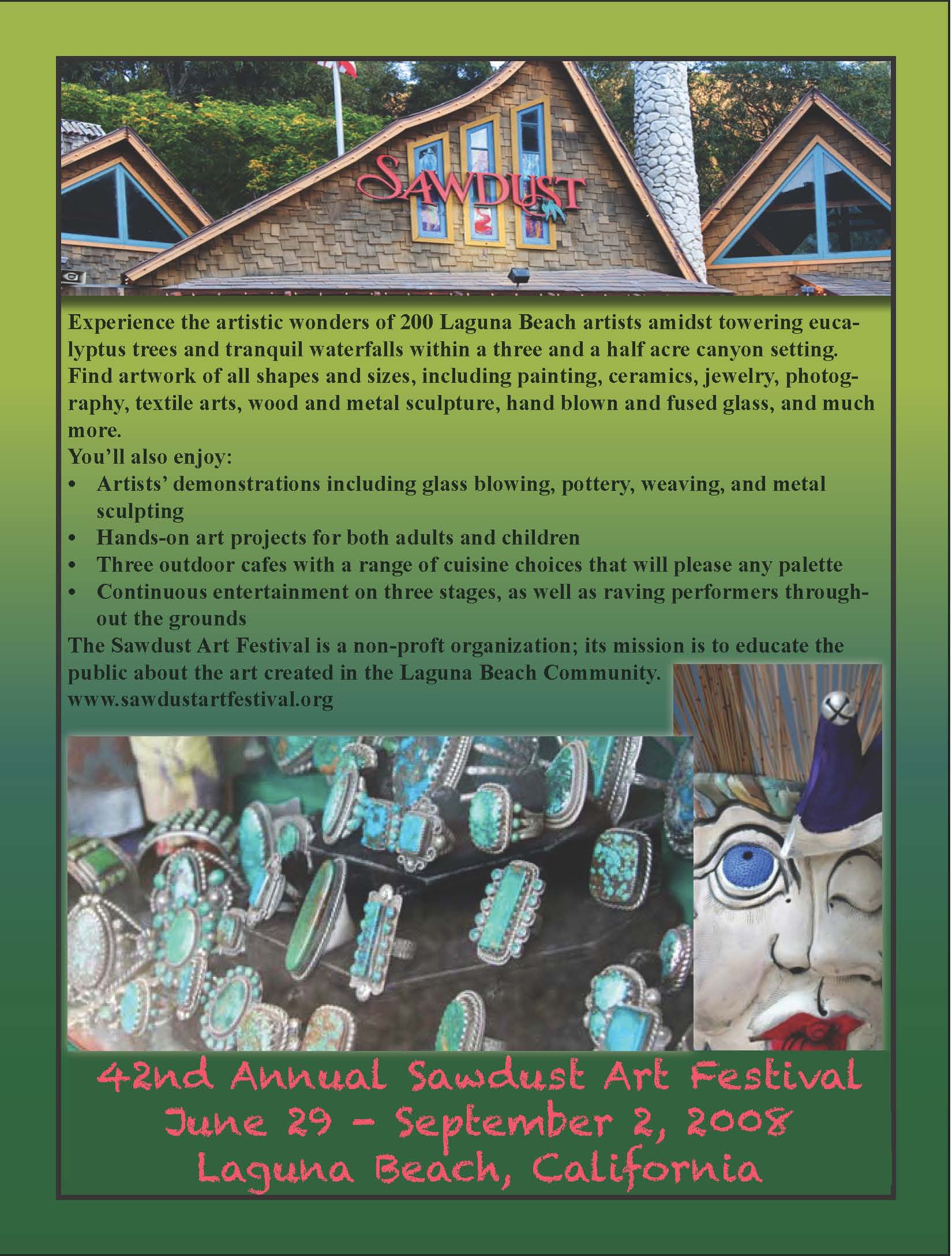
For the Sawdust Art Festival magazine ad, I used the main colors on the festival’s website as my first inspiration in creating the ad. In class, we learned to create a gradient swatch using a picture that was to be the main focus of the ad. I really enjoyed learning this skill, so I incorporated it into the ad. I chose the main picture of the festival to select colors, many shades of green and a shade of red, and created a gradient swatch, which then became the background of the ad. I chose to do a gradient as the entire background instead of a solid color because of the nature of the festival. The Sawdust Festival represents local art, so I wanted to be a little more creative with the background, which can typically be plain.
The main picture from the website is also the main picture on my ad. I chose this because of the interesting colors and because it has the name of the festival incorporated. I placed this picture at the top of the ad because it encompasses the Festival in every way, and also acts as a title for the ad. I think this picture could be the element that is also used on t-shirts and posters, which was a request from the “client” of the assignment. Towards the end of the ad, I also incorporated a few more pictures from the festival. These pictures give the viewer an idea of what kind of art is going to be featured at the festival. They also added a lot of other colors, which embraces the theme of local art. I added effects to all of the pictures in order to make them stand out from the background. I added a drop shadow to the title picture, and an “outer glow” to the two accessory pictures.
Since the background and pictures have so much color, I did not want to make the text too extravagant. All of the text on the ad comes from the required text from the “clients.” I placed the text in between the title picture and the additional pictures in order to break up the ad and create visual interest. I kept the text black and Times New Roman font because I wanted this aspect to be simple. I did, however, utilize bullets for a section of the text because it is a list. One of the design concepts says that using bullets helps make the text look less daunting to viewers. I think the bulleted text is more visually appealing than an entire paragraph of black text, especially for a magazine ad. At the very bottom of the ad, I created a text box with the basic information needed for the festival, such as the title, date, and location. I wanted this information to be separate from the block text because it the most vital information on the page. This is the information that is going to bring the viewers to the festival. In order to make it stand out, I also made this text colorful to further separate it from the black text.
I believe this ad will be attractive to the intended audience, art enthusiasts and residents of Laguna Beach, because of the colors and simplicity. The colors appeal to art enthusiasts because they are calm, yet interesting, and earthy.